The New Zealand Tech Alliance is a group of independent technology associations from across New Zealand that work together to ensure a strong voice for technology.
Visit Tech Alliance

The New Zealand Tech Alliance is a group of independent technology associations from across New Zealand that work together to ensure a strong voice for technology.
Visit Tech Alliance
The Bright Awards recognise young New Zealand high-school talent within the creative arts and technology fields. Since 2016, Media Design School has committed to help lift these creators and give back to their community.
The 2022 Bright Awards invited Year 11–13 students to showcase and celebrate their creativity in digital design and technology. Winners were handpicked from five categories on offer, including Animation, Graphic Design, Games, Web and Interactive, and Photography.
Winning students came from: Invercargill’s Southland Boys High School, Waikato’s Diocesan School for Girls, Whangārei’s Kamo High School. This year, Auckland’s Maclean’s College earned the top spot of “Bright School of the Year”.
We have seen a lot of determination and confidence in this year’s submissions, and we are excited for the talent in the year ahead, especially those that choose to study with Media Design School.

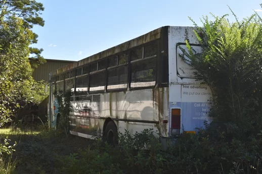
Hannah Dunk (Maclean’s College, Auckland) Project Name: Abandoned Bus
I wanted to convey the idea of decay and death of objects that humanity leaves behind. Like the vehicles I took photos of in my submission, I want to portray them as being full of life with the overgrowth and vibrant colours of the objects. I want to portray the beauty of the dead.
The judges said: “I like the fact she had a clear and straightforward concept and stuck to it while producing well-composed images with great attention to detail and light.”
Sean Pivac (Year 13, Kamo High School, Whangārei) Project Name: Dying for More
This short animation is about a rat who is blinded by greed and pays the ultimate price.
The idea was that he would be presented with many safe opportunities to satisfy his needs, but far from enough to satisfy his greed. His greed will prevent him from seeing the trap for what it is and lead him to his death. The title ‘Dying for More’ refers to his desire for the larger block of cheese and in this case it can be taken in a literal sense.
It was not really inspired by established practice at all. The purpose of this animation was solely to improve particular 3D skills. This project was aimed at animation and rigging. More specifically, I learnt a lot about shape keys. It has also helped reveal weaknesses in my skillset. Everything was created by me, using Blender, Photoshop and Premiere pro. Sound effects were recorded on iPhone. Music was not made by me, credited in the video. Thanks for the opportunity,
The judges said: “[Sean’s] animated narrative was captured beautifully; scenography, lighting, texture mapping, shot composition, camera movement and sound design were all strong. I was particularly impressed by the animation of your rodent – it was fantastic. Congratulations!”

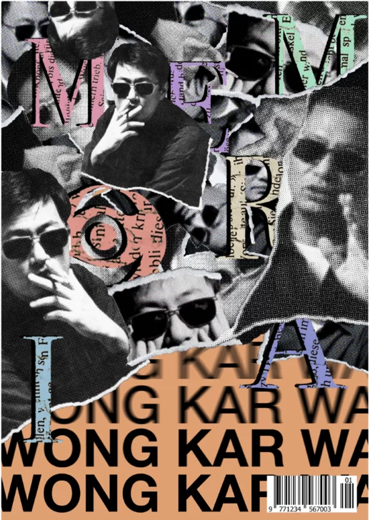
Ayaan Lakhani (Maclean’s College, Auckland). Project name: Memoria
The judges said: “Interesting use of the collage technique with a strong feeling of nostalgia, good use of grid and layout techniques for the composition.”
Alexis McKinnon (Waikato Diocesan School for Girls, Waikato). Project name: Lapsus
I have designed a 2D platformer that allows the player to control a character in order to restore the land and progress towards an ending through problem solving in which both the land and character have changed and have gone through growth.
As the player progresses through the story, the character begins to learn about the seemingly desolate world around them and what caused it to be while meeting new characters and gaining new skills to pass through the terrain.
‘Lapsus’ is the name chosen for this game, as in Latin it means slip and when translated from Romanian it means lapse, an interval or passage of time. I believe it represents the game well, as the game teaches about growth and loss over time. By restoring the world around them, the character in exchange gives up their own energy which the player must recharge at various points. The game concludes when the character inevitably runs out of energy completely in the final level and the world is restored.

The judges said: “Alexis had some creative and visually appealing character designs. A cohesive and creative simple side-scrolling environment presentation with a moodboard. Nice exploration of logo concept thumbnails. Sound idea/philosophy behind the name and theme about teaching growth and loss over time by trying to restore the world with the character’s energy.”

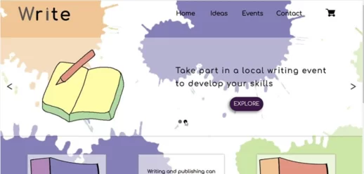
Oshadha Perera (Southland Boys High School, Invercargill). Project name: Write
I have designed a website for a literary organisation, that allows them to promote their events and provide information useful to writers. Many writers’ groups and organisations have basic websites, and they usually use social media platforms and newspapers to list their events and courses. For example, I have been to a few writers’ events myself, and I had to find the event through Facebook, register by email and payment was taken at the door. So, I thought a website that allows to get inspiration for writing, find events/courses, get information about them and register for them, from the same place would be beneficial in terms of ‘digitising’ the writing field and attracting more people to these events. So, I have coded an easy-to-navigate website which currently offers the options of generating random ideas and viewing/booking writing events (more information can be added if needed). The website was coded using a combination of HTML, CSS and JavaScript programming languages, and currently has a random word generator, events listings, a cart, and contact forms. In the design process, I have considered Jakob Nielsen’s 10 usability heuristics for UI design (as an example, I used a traditional layout so users can locate thing easily). From an aesthetic perspective, I have used a minimalist design and tried to use contrast in a nice way (light-coloured background, translucent containers, dark text). All images and background images were created by me using Adobe Photoshop.
The judges said: “Oshadha has put a lot of thought and effort into designing this website for a literary organisation. User experience was considered well and it’s great that he used Nielsen’s usability heuristics.
It’s also very useful that the website offers the ability to generate ideas, view and book writing events, and has a cart and contact forms. It looks like a useful resource for writers looking for inspiration and information on events and courses.
Overall, it is a well-designed website that will be helpful for writers and the literary organisation. I like the fact he had a clear and straightforward concept and stuck to it while producing well-composed images with great attention to detail and light.”
Congratulations to all our Winners of the 2022 Bright Awards and a huge thanks to the schools behind them that have cultivated their talent and set them on to a path of creative success!
Also, thank you to all other contestants that put in the time, hard work and effort to create beautiful pieces. The judging process was not easy and there were many close seconds and thirds. Keep pursuing your creative dreams, we can’t wait to see more of all the inspiring creations you’re chasing!
Interested in studying in Media Design School? For more information, click here.